



Winning Entries
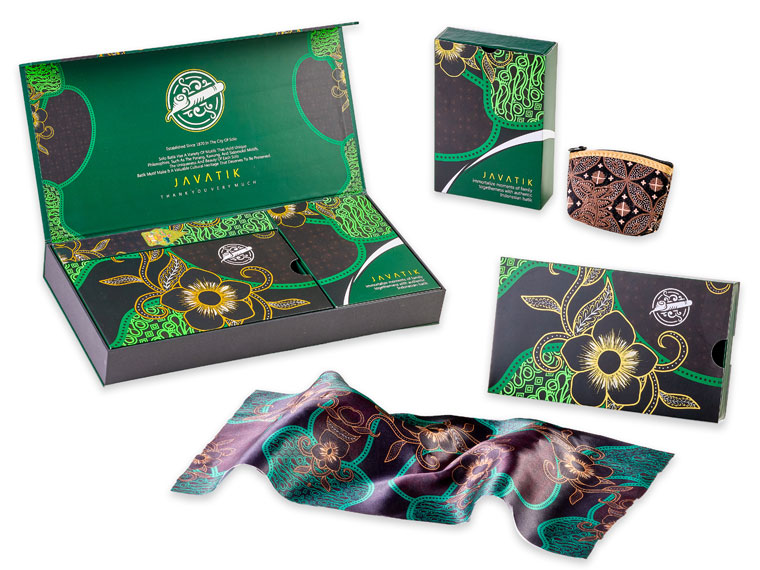
Sampurna Printshop(Indonesia)
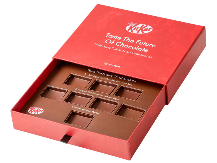
Visualtell Printing(Singapore)
This packaging combines elegant structural design with creative use of Gold, Green, and Pink toners to create a distinctive visual identity. Inspired by traditional craftsmanship, it demonstrates a high-quality, flexible, and cost-effective approach to premium packaging.
| Company | Sampurna Printshop(Indonesia) |
|---|---|
| Title | Javatik Packaging |
| Press | Revoria Press PC2120 |
| Judges' Comments | "This year’s ultimate winner has gone to new heights in creating this masterpiece, using their equipment to the fullest and by adding the new Green toner, which by the way just hits you in the eye and you “cannot miss it”. All the judges were unanimous in the decision to crown this job the Best Innovation Award Winner for the 2026 competition. A huge congratulations to the winning company, keep up the good work, it’s your customers who will really appreciate the effort you put into it."(Paul Callaghan) |
Created to support the launch of new chocolate flavours, this customised promotional box was designed to enhance customer engagement and deliver a memorable brand experience. Accurate colour management ensured strong brand consistency, while short-run production enabled efficient delivery for marketing and promotional activities.
| Company | Visualtell Printing(Singapore) |
|---|---|
| Title | KitKat New Flavours Box |
| Press | Revoria Press PC1120 |
| Judges' Comments | “If you ever need to produce a sample box for your product, this company has the answer. Great print, very clever design and a functionality that would work wonders for the ultimate client, in this case KitKat.”(Paul Callaghan) |
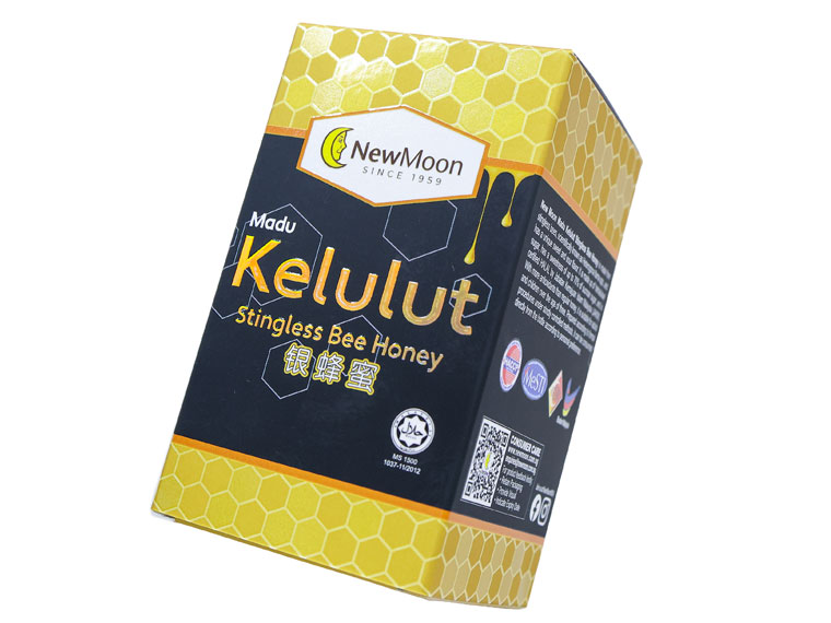
Refine Printing(Singapore)
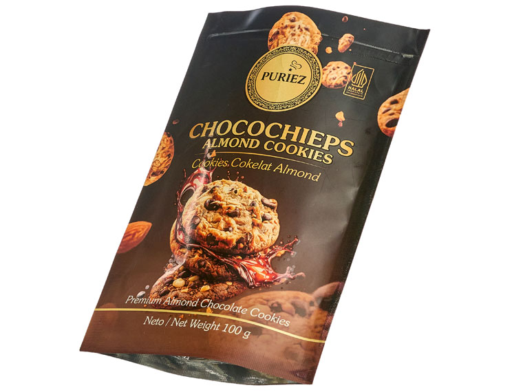
PT. KHIANT SUKSES BATAM(Indonesia)
Designed to increase product appeal, this package showcases the effective use of Gold toner to highlight key design elements and create a luxurious visual identity. The combination of premium appearance and production efficiency delivers a high-value packaging solution.
| Company | Refine Printing(Singapore) |
|---|---|
| Title | Madu Kelulut Stingless Bee Honey |
| Press | 6 Colours Production Press |
| Judges' Comments | “A combination of embellishments, spot varnish with different densities, foiling, matt effects, .. The bees have a new home made by the packaging. Nice to look at, attractive, copying the real look. Efficient and attractive.”(Christian Menegon) |
Designed to elevate product presentation, this stand-up pouch makes effective use of Gold toner to enhance perceived value and strengthen brand recognition. Combined with flexible digital production, it delivers a premium packaging solution that supports product differentiation and efficient small-lot manufacturing.
| Company | PT. KHIANT SUKSES BATAM(Indonesia) |
|---|---|
| Title | Standing Pouch Puriez Almond Cookies |
| Press | 6 Colours Production Press |
| Judges' Comments | “A stand up pouch using the trick of dark background around the photo of the product to highlight it, reinforced by a spot varnish and overprinted gold areas to bring some variations in the tint. All ingredients to make the product visible and attractive.”(Christian Menegon) |
Refine Printing(Singapore)
Hangzhou JiuCai Label Co., Ltd.(Chinese Mainland)
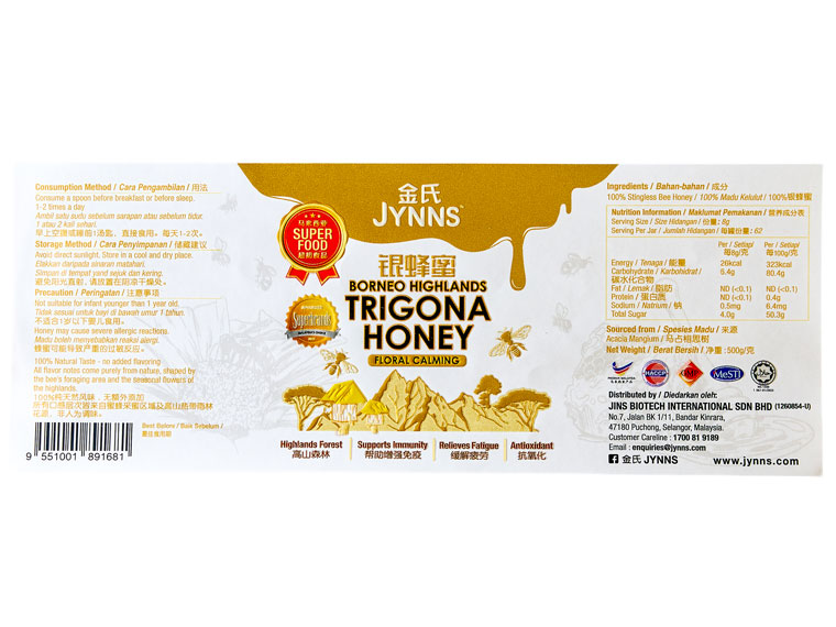
Combining Gold toner with 3D Spot UV and Texture UV embellishments, this piece creates strong visual contrast and a distinctive tactile experience. Developed to enhance brand presence, it demonstrates how digital production can deliver premium results with consistent quality and efficient turnaround.
| Company | Refine Printing(Singapore) |
|---|---|
| Title | BORNEO HIGHLANDS TRIGONA HONEY |
| Press | 6 Colours Production Press |
| Judges' Comments | “What a solid label that this company has produced. They have added all types of embellishments and combined with the print quality the finished result is just fantastic.”(Paul Callaghan) |
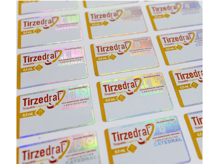
3D Spot UV, and Texture UV embellishments work together to create rich visual contrast and a distinctive tactile experience. These layered effects add depth and sophistication, enhancing perceived value while showcasing the creative possibilities of digital embellishment.
| Company | Hangzhou JiuCai Label Co., Ltd.(Chinese Mainland) |
|---|---|
| Title | Digital Security Laser Coated Label |
| Press | Revoria Press PC1120 |
| Judges' Comments | “What looks simple to the naked eye is not always what it seems. This small label is just packed with security features and finished off with excellent print quality. Let's see people try to copy this on the black market!”(Paul Callaghan) |
KHANG VIET DESIGN & PRINTING CO., LTD(Vietnam)
Seven Eight Nine Print Tech Co., Ltd.(Thailand)
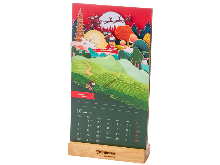
Designed as a premium New Year gift for clients and partners, this project combines a multi-layered structural design with a custom kraft paper sleeve to create a memorable brand experience. Precise registration and efficient short-run production enabled complex construction while maintaining flexibility, quality, and consistency.
| Company | KHANG VIET DESIGN & PRINTING CO., LTD(Vietnam) |
|---|---|
| Title | Calendar - Ninja Van |
| Press | Revoria Press SC285 |
| Judges' Comments | “Eye popping Ninja Calendar, clarity in prints, Strong RED color of Ninja depicts visible and impactful as a desktop calendar. Good finishing in its layered die-cut outline that gave a humorous display of Ninja, swift and quick as a desk calendar.”(Major Wong) |
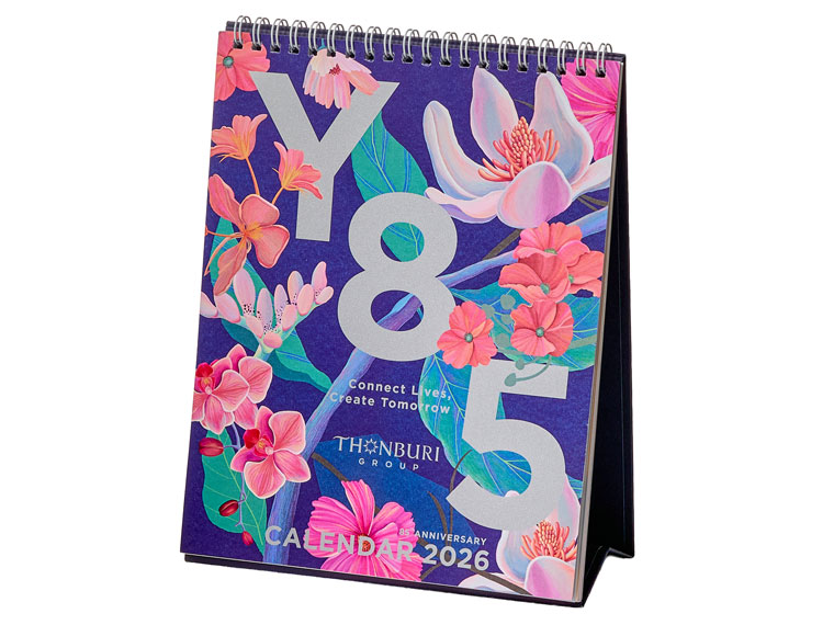
Created to celebrate a long-standing partnership, this premium calendar uses Silver and Pink toners to express prosperity, trust, and sustainable growth. The refined colour palette enhances the floral artwork and creates a memorable brand experience, reinforcing the values shared by both organizations.
| Company | Seven Eight Nine Print Tech Co., Ltd.(Thailand) |
|---|---|
| Title | Calendar 2026 Thonburi Group 25th Anniversary |
| Press | Revoria Press PC1120 |
| Judges' Comments | “Aspiring design on one side, Silver color enhanced the graphic and images, visibly projects a good desktop calendar display that is eye catching to any onlookers as well one who needs to plan ahead for tomorrow.”(Major Wong) |
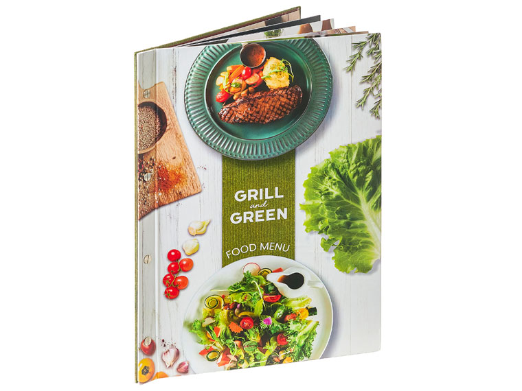
Neo Digital Co., Ltd.(Thailand)
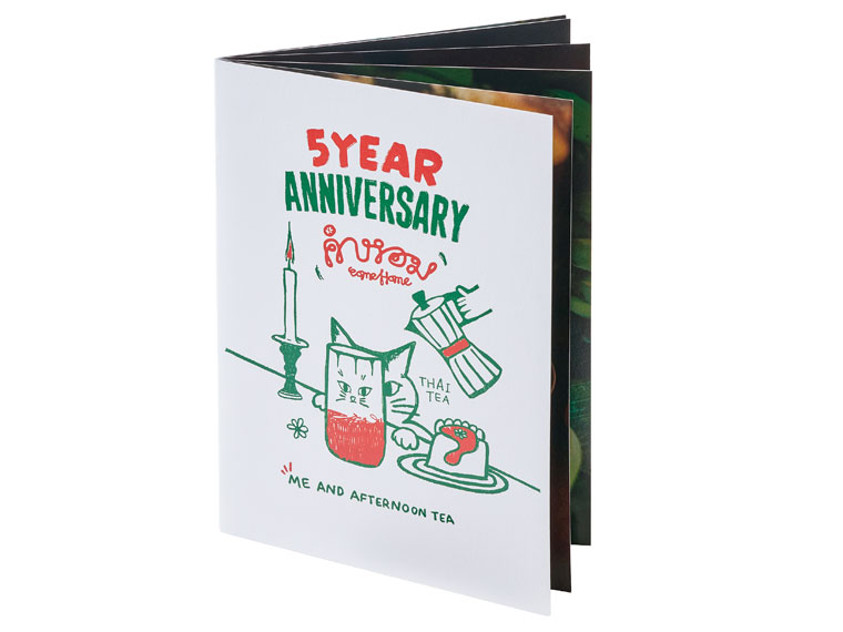
Press Creation Co., Ltd.(Thailand)
Created for Grill and Green, this premium menu reflects the brand’s commitment to organic ingredients, quality, and sustainability. Its durable hardboard construction supports long-term use, while digital printing enables efficient short-run production, fast updates, and consistent quality to meet changing business needs.
| Company | Neo Digital Co., Ltd.(Thailand) |
|---|---|
| Title | GRILL and GREEN FOOD MENU |
| Press | Revoria Press PC1120 |
| Judges' Comments | “Almost scale 1 size of the plate's illustrations. The menu is a bit large for its use, but the whole experience of handling it and going through the pages make the user understand how efficient it is. Realistic view in quality and illustrations sizes. ”(Christian Menegon) |
Designed to deliver a warm and inviting dining experience, this menu combines durable materials with refined design. The hardcover format and textured paper enhance usability and longevity, while digital production supports efficient updates, consistent quality, and a premium presentation that reinforces the restaurant’s brand identity.
| Company | Press Creation Co., Ltd.(Thailand) |
|---|---|
| Title | Menu Comehome Café |
| Press | 4 Colours Production Press |
| Judges' Comments | “The cover looking simplistic and fun contrasts with the inside pages illustrating cocktails in large size. The photos bring an atmosphere from their quality. The paper thickness makes it a very usable drinks menu.”(Christian Menegon) |
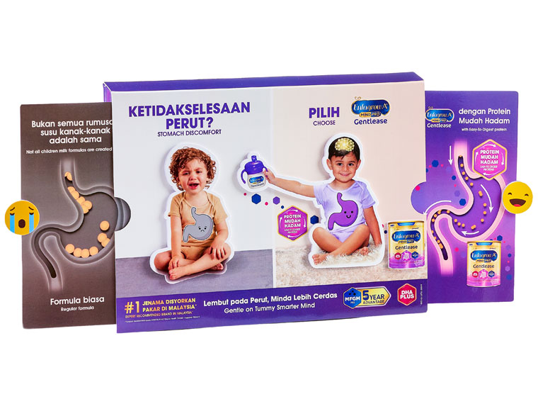
BUP GROUP SDN BHD(Malaysia)
Designed to educate parents about child nutrition, this interactive retail display combines learning and play to create a more engaging customer experience. Movable elements encourage participation, while premium print effects help communicate information in a memorable and accessible way.
| Company | BUP GROUP SDN BHD(Malaysia) |
|---|---|
| Title | ENFAGROW INTERACTIVE BOARD |
| Press | 6 Colours Production Press |
| Judges' Comments | “The whole purpose of POD is to attract the potential customer to consider the product. This year's winner has used digital print with a very clever constructed expanding job that will absolutely get people to notice it and the product. Which is the goal of this being in the children's health area of consumer buying.”(Paul Callaghan) |