


Winning Entries
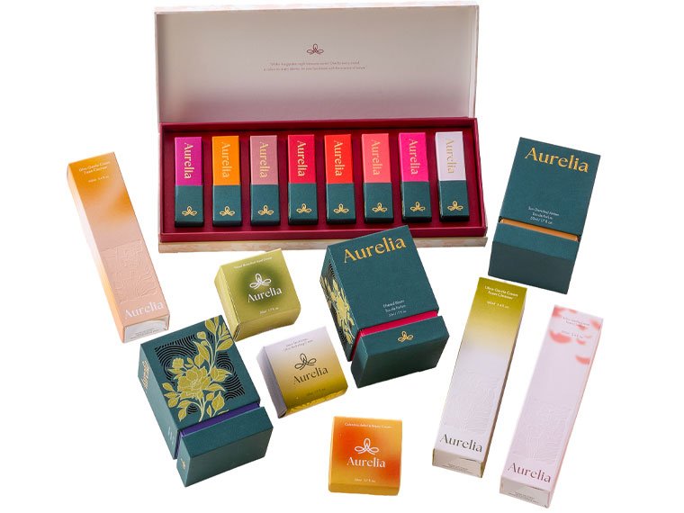
WIDE OCEAN PRINTING CO. LIMITED(Hong Kong SAR)
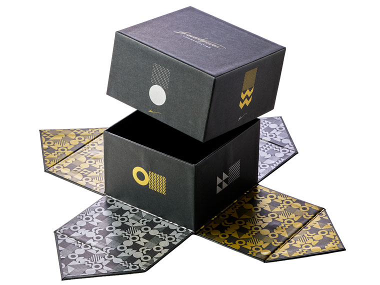
Tipografia Grafica Sette (Italy)
Featuring auto-lifting box mechanisms, innovative structures, and White and Gold toner embellishments, this series demonstrates how packaging can extend beyond product protection. By combining functionality with a memorable unboxing experience, it strengthens brand storytelling and customer engagement.
| Company | WIDE OCEAN PRINTING CO. LIMITED(Hong Kong SAR) |
|---|---|
| Title | WIDE OCEAN - Aurelia Cosmetics and Skincare Packaging Series |
| Press | Revoria Press PC1120 |
| Judges' Comments | “For this year's winner in this category, we have seen what could only be described as the all round perfectly constructed rigid box for the highly demanding cosmetics industry. The many pieces that make up this job and the quality control the company has insisted on make this a stand out job.”(Paul Callaghan) |
Serving as a self-promotional piece, this magnetic gift box showcases how digital metallic effects can be integrated into premium packaging. Combining Gold and Silver toner within a single workflow, it demonstrates an efficient approach to producing customised, short-run luxury applications without conventional foiling.
| Company | Tipografia Grafica Sette (Italy) |
|---|---|
| Title | Self Promo Box |
| Press | Revoria Press PC1120 |
| Judges' Comments | “What looks simple is not the case here. This solid rigid box combined with silver and gold on solid black, when opened up completely is just a great example of keeping it simple.”(Paul Callaghan) |
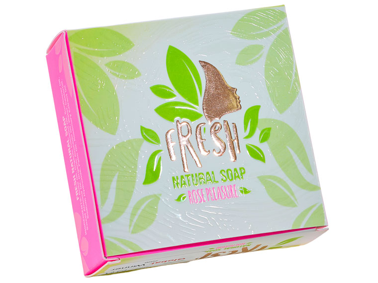
bigDAWGS®(Canada)
Seven Eight Nine Print Tech Co., Ltd.(Thailand)
Balancing luxury with a fresh and natural image, this packaging uses textured surfaces and Pink toner to strengthen brand recognition. The project demonstrates how customised, short-run packaging can be produced efficiently while maintaining visual consistency across the product range.
| Company | bigDAWGS®(Canada) |
|---|---|
| Title | Fresh Natural Soap - Rose Pleasure Packaging |
| Press | Revoria Press SC285 |
| Judges' Comments | “The combination of flashy colour, spot varnish, foiling, different glossiness backgrounds, and fresh non saturated design supports the message from the product: always fresh look. Nice match product - package!”(Christian Menegon) |
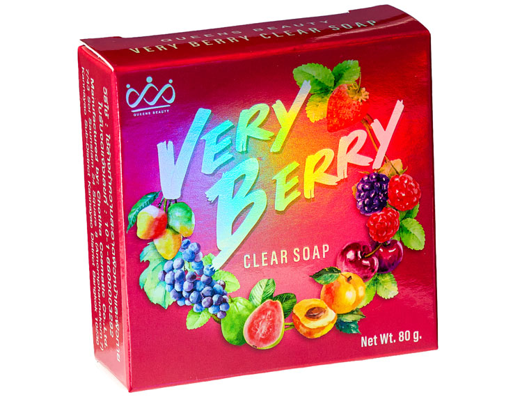
Built around a holographic silver substrate, this packaging explores how metallic materials can enhance brand recognition on retail shelves. The project demonstrates accurate colour reproduction on a challenging surface while enabling flexible, short-run production for premium consumer products.
| Company | Seven Eight Nine Print Tech Co., Ltd.(Thailand) |
|---|---|
| Title | Queens Beauty Very Berry Clear Soap |
| Press | Revoria Press PC1120 |
| Judges' Comments | “Appealing by its metalised base, the main colour matching the name (berry), the respect of the consumer with text fonts large enough despite a small box overall, consumers will see it and will be attracted.”(Christian Menegon) |
bigDAWGS®(Canada)
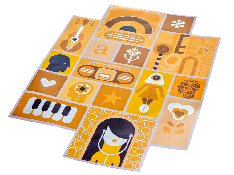
Bringing retro-inspired graphics into the retail environment, this floor graphic was developed to encourage customer interaction and strengthen in-store engagement. Holographic glitter lamination, raised foil, and Pink toner combine to create a durable application that remains visually distinctive under heavy use.
| Company | bigDAWGS®(Canada) |
|---|---|
| Title | Retro Holographic Glitter Floor Graphics |
| Press | Revoria Press SC285 |
| Judges' Comments | “For the first time in the competition history we have been given a label produced to be put on the floor. This label is produced with all manner of production features to last the tough life on being walked on time and time again. Then add in the embellishment and it's a total eye catching product.”(Paul Callaghan) |
Jaeseung Group Co., Ltd.(South Korea)
TYPOSET, Ltd(Slovakia)
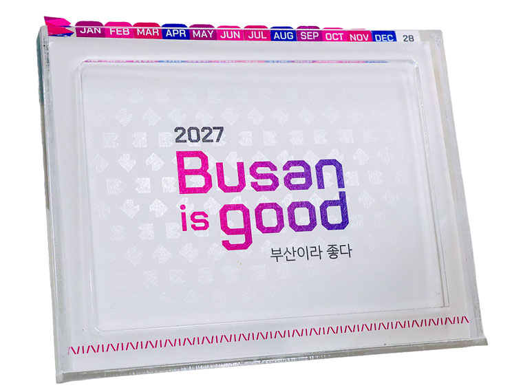
Promoting Busan’s culture and identity through an everyday product, this calendar combines die-cut elements, layered graphics, and Textured toner effects to create changing visual impressions throughout the year. It serves as both a practical desk accessory and a lasting reminder of the city’s character.
| Company | Jaeseung Group Co., Ltd.(South Korea) |
|---|---|
| Title | The Story of Busan : Acrylic Desk Calendar |
| Press | Revoria Press PC1120 |
| Judges' Comments | “Small desk calendar, small text, yet visible with the graphics and background design. Enhanced with die-cut of Korean Text on each page that gives an impactful marketing that Busan is good….”(Major Wong) |
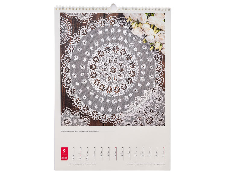
Celebrating Slovakia’s embroidery heritage, this calendar was developed to preserve and share traditional craftsmanship with a wider audience. Through carefully documented imagery and print reproduction, it transforms cultural artefacts into an accessible format that can be appreciated throughout the year.
| Company | TYPOSET, Ltd(Slovakia) |
|---|---|
| Title | Detvian Folk Art / Detvianske l'udové umenie - Calendar 2025 - Limited Edition |
| Press | Revoria Press SC180 |
| Judges' Comments | “This calendar does its job as a calendar: You can see the date! And while the format may look traditional, it allows the company to highlight representative photos of their production. In this case the lace based products are exposed in a traditional environment and background which matches where it can be found.”(Christian Menegon) |
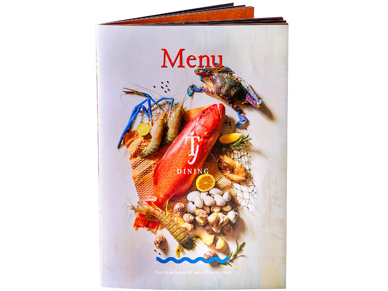
M.I.W. Group Co., Ltd.(Thailand)
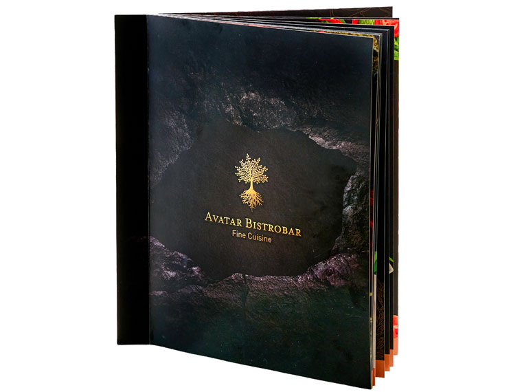
Neo Digital Co., Ltd.(Thailand)
Combining durability with a premium dining experience, this menu features a 180-degree lay-flat design that allows content to be viewed comfortably across double-page spreads. Its robust construction helps reduce replacement frequency, making it a practical long-term solution for busy restaurant environments.
| Company | M.I.W. Group Co., Ltd.(Thailand) |
|---|---|
| Title | Ta Lay Jai Dining Menu |
| Press | Revoria Press PC1120 |
| Judges' Comments | “Great design and execution for this menu. Flexible, easy to handle, great print quality and great design brings luxury look on a simple product. The photos are the center of the interest non visually disturbed by the background. The plate details are very visible next to the high quality plate photo.”(Christian Menegon) |
Built for intensive daily use, this menu combines corner-screwed binding and full lamination to provide long-lasting durability. Its robust construction helps reduce replacement frequency while maintaining a refined presentation, making it a practical solution for premium dining environments.
| Company | Neo Digital Co., Ltd.(Thailand) |
|---|---|
| Title | Avatar Bistrobar Cuisine. |
| Press | Revoria Press PC2120 |
| Judges' Comments | “This menu could be found in a library from its aesthetics and finishing. The high quality realistic photos of the plates appear on a neutral but nice background. The texts in white on one side are the reflection of the images on the next page. It looks like a real high luxury book. Efficient and pleasant to handle.”(Christian Menegon) |
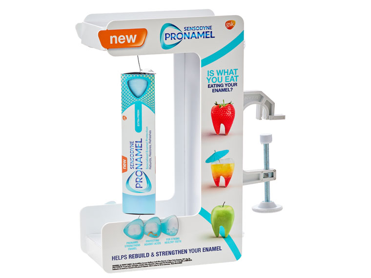
KYTA Industries (PTY) Ltd(South Africa)
Bringing product information and visual storytelling together, this retail display was developed to simplify consumer decision-making at the point of purchase. Its infographic-inspired structure presents key benefits in a clear and engaging format while strengthening product visibility in store environments.
| Company | KYTA Industries (PTY) Ltd(South Africa) |
|---|---|
| Title | Sensodyne Product Glorifier PSU |
| Press | Acuity Prime Series |
| Judges' Comments | “What a novel concept they have built for this campaign. It just shows you the true power of digital print production, and when the designer knows what they are doing this is what you get, an all round winner.”(Paul Callaghan) |